Steven Morgana
"I feel it’s important that each work strives to represent the diversity of our delirious online image ecology, which inevitably includes nudity and sadly also graphic images of atrocity and conflict."
Could you tell us a bit about yourself. How long have you been a practicing artist and where did you study?
Millennial and originally from Australia, where I spent most my life growing up on the country’s Wild West Coast in a city called Perth.
In 2010 I moved to the UK to study my MFA at Goldsmiths College. And thanks to my EU passport, I’ve since been able to remain in London, where I currently have a studio in the SE of the city.

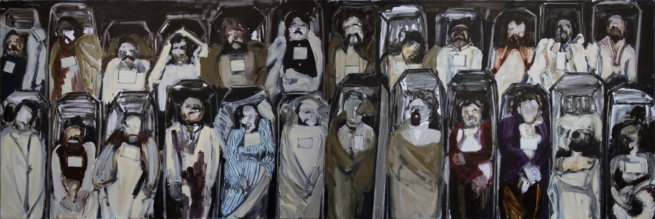
CACHE (x3, y6), 2016
CACHE (Shuffle) (x3, y5)
CACHE (x8, y4), 2016
Could you tell us a bit about the piece titled ‘CACHE”?
CACHE is a new series informed by my interest to explore the delirium of 21st century visual culture. In particular, the work came out of thinking about the nature of images in the context of image- aggregating social networks. I decided to turn to the ubiquitous scaffold structure as a form to help me explore this idea. However, rather than metal tubes I use large format archival printed copies of found web-based images, which I tightly roll into tubes and then display on lightweight scaffold couplers cold cast in aluminium. I then link one image to another until I arrive at a form yielding a fragmented, nonlinear and distracted visual experience.
In much the same way as we’re forced to adjust the constraints, size and orientation of an image we wish to post on social media, the images I ‘post‘ are adapted to the restrictions of the structure they’re displayed on, whereby rolling and displaying in the form of a tube, the images become cropped and their resolution reduced.
With regards to the kinds of images I use in the work, their nature varies immensely. The only criterion I follow in my selection of images is that they depict a texture, motif or pattern that I feel resonates with our current condition. The images range anywhere from finger shoes, mosquito bites and protein powder, quinoa, stock graph charts and remote-sensing imagery, Apple earpods, cats and contactless cards through to shelled Ukrainian civilians, drowned refugees, the victims in Nice and Kim Karadashian’s ass.
As this list indicates, I feel it’s important that each work strives to represent the diversity of our delirious online image ecology, which inevitably includes nudity and sadly also graphic images of atrocity and conflict. This is where my works differs explicitly from the social media networks they trace. I feel the issue with this sort of imagery has nothing to do with their content, no matter how graphic or controversial, as much to do with the online structures that these kinds of images come up against for visibility and ultimately legitimacy.
When seeing this work some people say to me that the inclusion of images of atrocity and conflict, and their adjacency to more benign and mundane imagery, is deeply problematic to them. Most recently, someone even said sharing this kind of imagery devalues the currency of shared humanity. Wow! Seriously? I mean, I don’t think life can be devalued any further when already there’s little to no respect for it. Our shared lack of respect for life is pretty self-evident in the lifestyles ‘we’ lead, though it’s more an effect of the current structural alignment between cultural, political and economic spheres within society than a conscious decision on our part. Looking at these images can’t dehumanize us any further from the condition we currently embody at present, but rather has the potential to reveal to us our actual and present state of inhumanity. Amidst all the kaleidoscopic textures, motifs and patterns displayed in this series of works, CACHE, hopefully, offers that very potential.

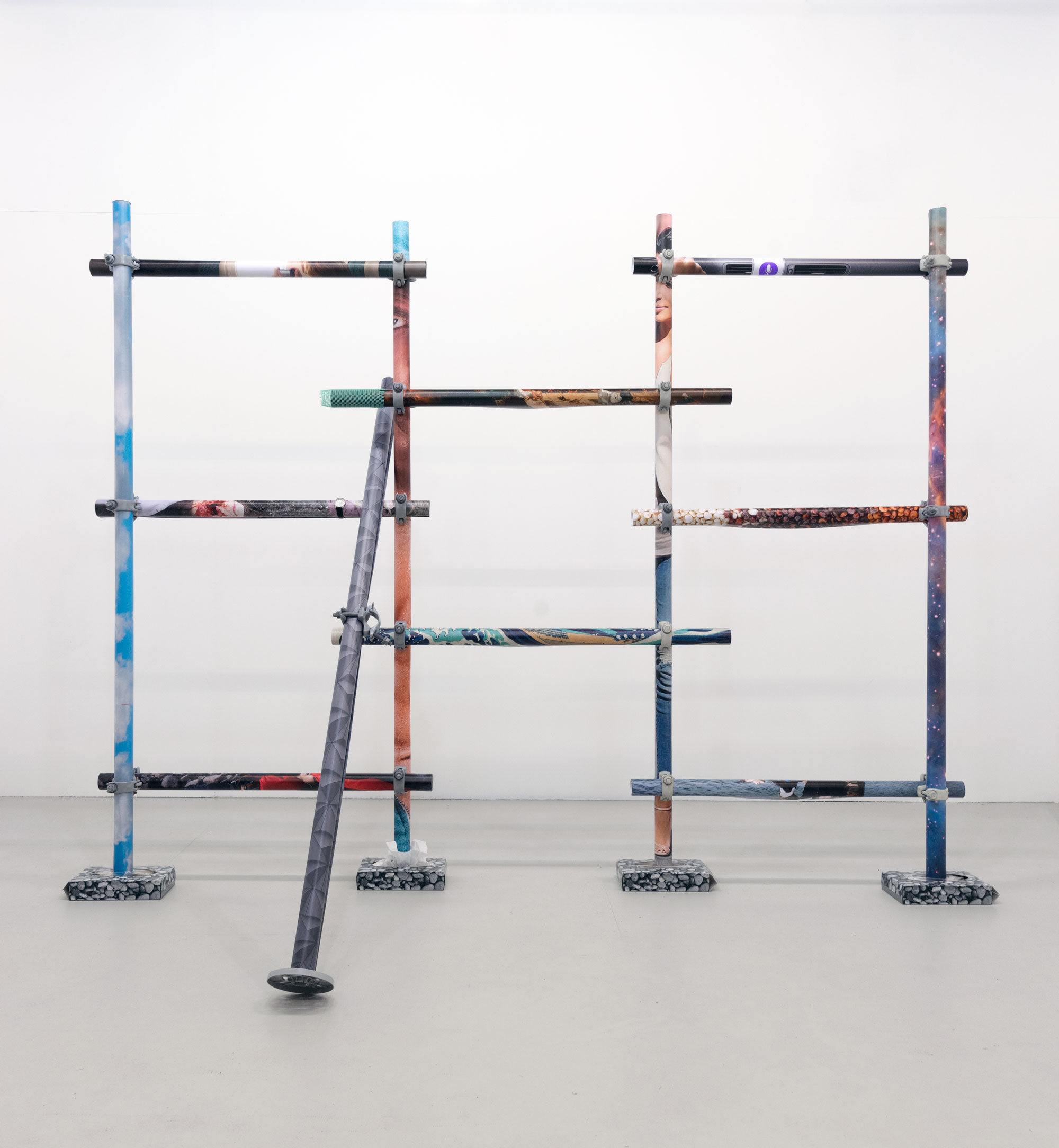
It Was All Ephemeral as a Rainbow, 2016
It Was All Ephemeral as a Rainbow (installation shots), 2016
You have also worked with materials like petrol and neon lights using generators, could you tell us the thoughts behind this?
'It Was All Ephemeral as a Rainbow' (IWAER) is a complicated work to describe. Put briefly, I set out with the intention of using the motif of the ‘rainbow’ as a tool to aggregate a range of materials that either directly addressed or alluded to ideas and conditions to do with scarcity but which also very strangely all embodied aspects of the spectrum. Let me see. Maybe it would be best if I tackle this by perhaps first talking about one of the materials that really informed how I went on to develop the work. Plus it’s a material with a really great story behind it.
During my research for the work IWAER, in 2012 I came across online a pdf copy of a book, titled, Talisman Terry’s Energy Adventure. It’s a 24 page colouring-in book released in 2011 by the Canadian oil and gas company, Talisman Energy, aimed at instructing children about the ostensible virtues of fossil-fuel extraction. Numerous reports criticising the company for engaging in child-directed propaganda forced Talisman to shelve the promotional book, but not before someone was able to fortunately upload a pdf copy of the book online. When clicking through the book, I was surprised to find the page depicting the ‘after drilling’ scene used the illustration of a rainbow to somehow give it a more ‘natural’ and aesthetically pleasing look compared to the preceding ‘before drilling’ scene that had no rainbow. I read this as a perverse form causality, whereby the emergence of a rainbow was somehow predicated on the extraction of fossil fuel.
After some further research I discovered that several years before the book’s publication, Talisman had begun exploratory drilling operations in the Amazon rainforest, and more specifically on the ancestral land of the indigenous Achuar people. When searching online for images of the Achuar, I was further surprised by the rainbow-like appearance of their traditional headdress, made from an assortment of brightly coloured bird feathers.This convergence of coinciding ‘spectra’ lead me to create the work, Scenic Clashes, which exists both as a series of prints and also as remixed and redistributed copy of the original pdf.
Each print shows a member of the Achuar photographed wearing their headdress in different contexts, with an overlay of the colouring-in book’s ‘After Drilling’ page. Pictorially speaking, the result is one where the Achuar’s headdress ‘colours-in’ Talisman’s rainbow.
This might be construed as uncomfortably ironic, but I saw this as more a way to visualise the struggle over an immense expanse of land, which one party saw as scared and the other as a mere commodity.
Months following this work I learnt that after eight years of fighting Talisman in the courts, the Achuar finally, and to many unexpectedly, won their case, forcing Talisman to announce it would be withdrawing from the Achuar’s ancestral territory. And in doing so, I guess they also altered the meaning of Scenic Clashes.
The other materials in IWAER include a light sculpture that exploits neon lights and a curved mirror to produce the illusory image of a double circular rainbow, a portable petrol generator and dozens of bottles of water decanted with unleaded petrol.
My decision to use a portable petrol generator to power the sculpture stemmed from wanting to highlight the often-overlooked and non-renewable energy source powering almost all light- based artworks today, ranging from neon and fluorescent light sculptures through to projection and screen based works.
I felt that the best way to do this was by getting the work to operate ‘off-grid’ from an independent source of electricity that doubled also as a sculptural stand-in for our currently dominant and mostly non-renewable energy regime.
In an alchemical-like twist, the water bottles decanted with unleaded petrol are used to refuel the generator daily. The alchemy is further reinforced by the fact that the price of the bottled water was then and still is today more expensive per litre than the price of unleaded petrol. And in keeping with the rainbow motif, I chose to use Volvic’s flavoured bottled water range, in which the individually coloured caps of each flavour of water make up the spectrum. Back inside the gallery the double rainbow image - suggesting all sorts of different things to different viewers, ranging from the idea of nature as untouched by human labour, antithetical notions of beauty and kitsch and various progressive social movements – is all along powered by this external and distantly extracted geological resource, which through its combustion becomes ‘meteorological’ as it’s released into the atmosphere.

How Much Does Your Building Weigh?, 2012
In 2012 you made a major piece called “How Much Does Your Building Weigh?” Can you tell us a bit about this project and the ideas behind it?
The idea behind the work 'How Much Does Your Building Weigh?' was basically to build a geodesic dome using only cardboard packaging which arrived with the materials that I’d ordered for the work IWAER, and then gather all the offcuts pieces of cardboard created during the construction of the dome and suspend them both from a pulley system to see how much each one weighed.
Building the dome, taking care to efficiently cut as many triangular panels from the rectangular sheets of cardboard packaging as possible, I was convinced that it would end up weighing more than the total weight of all its offcuts. When it finally came to suspend the dome together with the stack of all its offcuts, I discovered that actually both weighed about the same. And more surprisingly still was how the counterbalancing weight of the offcuts casted aspersions on the dome’s strong reference to sustainability; lifted off the floor by the weight of its waste, the dome had become an architecturally redundant and in some sense now truly utopian structure.
ECHOES (Remix) ft. Naruto & Inmoov, 2016
ECHOES (Remix) ft. Naruto & Inmoov (detail)
What do you hope the viewer gains/reacts from looking at your work?
Damn! What a question. Look, I’ll speak from the perspective of my more recent and current work, from which, if anything, I hope it might get someone out there to think, “What kind of society do we live in that gives rise to a form of subjectivity that produces this kind of work?”
Tell us a bit about how you spend your day/studio routine? What is your studio like?
In the studio there’s no routine. It’s all experimental.
How do you go about naming your work?
I follow the formula: text follows texture; the titles emerge always in the making of the work.
Patterns (Parentless, Deafblind & Brain Injured), 2016
Psychodiagnostiks, 2016
What artwork have you seen recently that has resonated with you?
It’s not really a discrete artwork but more a studio visit I made a couple months ago that most recently resonated with me. I went to visit the artist Thomas Hirschhorn at his studio in Paris. I remember being impressed by his generosity but moreover by the setup of his studio. Literally every surface of his studio – walls, floor and tables – was covered with printed, online sourced images of atrocity. I became quickly aware that many of the images in front of me were the exact same ones back in my studio in London. This moment of deja-vu really resonated for me in ways I have yet to fully understand.
What does the future hold for you as an artist? Is there anything new and exciting in the pipeline you would like to tell us about?
My partner has just got this amazing job with an NGO based in Berlin that focuses on climate change in the least economically developed countries in the world. So I’ll be moving to Berlin very soon. Asides from learning German, finding a studio and continuing with my practice, I really look forward to visiting with my partner the regions and countries that the NGO works with.
Interview published: 30/09/16